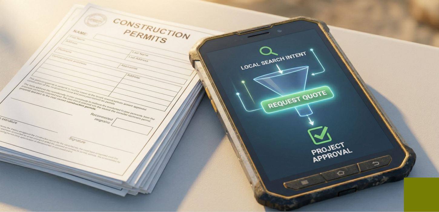
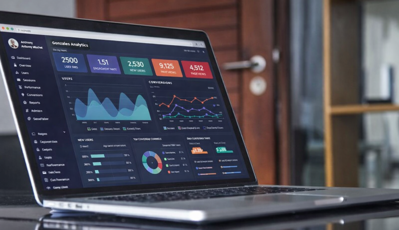
You have spent real money getting people to click. Whether through Google Ads, a social campaign, or organic search traffic, every visitor who lands on your page represents budget invested and attention earned. What happens next in the first three to five seconds determines whether that investment pays off or evaporates.
So, what makes a good landing page? The answer is not a beautiful design or clever copy on its own. A landing page that converts has a specific architecture: a set of elements working together to move a visitor from uncertainty to action. Miss one, and your conversion rate drops. Miss several, and your page becomes an expensive traffic sink.
At Exposure Media, landing page design and optimization is central to everything we build because a great ad paired with a weak landing page is simply a waste of spend. Here are the seven elements that separate high-converting landing pages from average ones.
A Headline That Immediately Answers the Visitor’s Core Question
The most important words on your landing page are the headline. Before anything else, a visitor needs to see confirmation that they are in the right place that this page is specifically for them and specifically solves what they were looking for.
Strong landing page headlines are specific, benefit-focused, and aligned with the ad or link that brought the visitor there. If someone clicked an ad promising “fast website design for plumbers,” the headline should reinforce that promise immediately. The gap between what the ad said and what the page delivers known as message mismatch is one of the most common causes of high bounce rates.
Avoid vague, self-congratulatory headlines like “The Best Digital Marketing Agency.” Instead, write headlines that speak to the visitor’s desired outcome: “More Leads From Google Ads Guaranteed Transparent Reporting” is immediately more compelling and credible.
Learn how our online marketing solutions can help you generate more leads and conversions.
A Supporting Subheadline That Extends the Conversation
The subheadline, typically placed just below the main headline, is where you have a few more words to elaborate on your value proposition. This is the place to introduce a secondary benefit, address a likely objection, or add a qualifier that filters for your ideal customer.
Think of the headline as the hook and the subheadline as the proof that the hook is worth taking seriously. Together, they form the opening of a conversation that the rest of the page continues.
The combination of a strong headline and subheadline is what makes a good landing page feel immediately relevant rather than generic. Visitors should feel within seconds that the person who built this page understands exactly what they need.
A Hero Visual That Reinforces the Message
People process visuals dramatically faster than text. The hero image or video at the top of your landing page is not decoration — it is a persuasion tool that either reinforces your message or undermines it.
For service businesses, images of real people, real results, or the service being delivered outperform stock photography consistently. For software or digital products, a clear product screenshot or demo video showing the product working does more to build confidence than any amount of written description.
Videos are particularly effective when the product or service needs demonstration or when social proof can be delivered through a short customer testimonial. A well-produced 60-second video on a landing page can increase conversion rates substantially by addressing objections that text alone cannot overcome.
Design principle: Your hero visual should show the outcome your customer wants, not just the product you sell. People buy the result, not the process.
Trust Signals That Overcome Skepticism
A visitor who has never heard of your business brings skepticism with them. Trust signals are the page elements that neutralize that skepticism by providing third-party evidence that you deliver what you promise.
The most effective trust signals include genuine customer reviews and testimonials with names and specific outcomes; client or partner logos that demonstrate credibility through association; industry certifications or awards; case study results with real numbers; and trust badges such as security seals for transaction pages.
The key word is genuine. Visitors can detect fabricated or overly polished testimonials, and nothing erodes trust faster than signals that feel manufactured. Real quotes from real customers even if imperfectly written, outperform marketing-language testimonials that sound too polished to be authentic.
Learn more about our experience and approach on our about us page.
Clear Benefits Stated Over Features
Features describe what your product or service does. Benefits describe what it means for the customer. The distinction matters enormously on a landing page where you have limited time and attention.
“We use a 22-point optimization checklist” is a feature. “Your ads stop wasting budget on clicks that don’t convert” is the benefit that feature delivers. Benefits speak to outcomes, emotions, and business results. They make the visitor see themselves on the other side of using your product or service.
A strong landing page communicates three to five core benefits clearly ideally with short, scannable copy and supporting icons or visuals. Long paragraphs buried in body text lose most visitors before they reach the call to action. Understanding what makes a good landing page often comes down to this single principle: lead with what the visitor gains.
One Clear, Dominant Call to Action
Landing pages with multiple competing calls to action “Learn More,” “Get a Quote,” “Watch Our Demo,” “Download the Guide,” “Call Us” — spread visitor attention and reduce conversion. Every option you add forces a decision, and decisions create friction.
The highest-converting landing pages focus on a single primary action and make that action visually obvious. The CTA button should stand out through contrast, be surrounded by white space, and use copy that communicates the value of clicking rather than just describing the action.
“Get My Free Quote” converts better than “Submit.” “Start Growing My Business” converts better than “Sign Up.” The copy should reflect what the visitor gets, not what they give. This principle one clear conversion goal is one of the most consistent answers to what makes a good landing page. When in doubt, simplify.
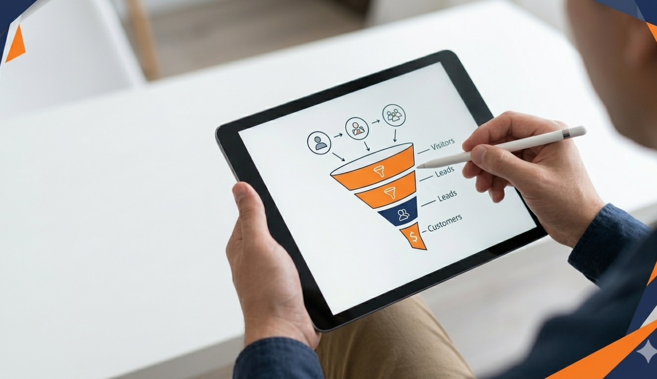
A Frictionless Lead Capture Form
If your landing page goal is lead generation, your form is the final gate between a visitor and a conversion. Every unnecessary field is a reason for them to leave without submitting.
Research consistently shows that conversion rates drop as form length increases. For most service businesses, a form asking for name, email, and phone number outperforms a form that also asks for project budget, timeline, location, and a detailed project description — even if that additional information would be useful to your sales team.
The right approach is to capture the minimum information needed to qualify the lead and gather additional details during the first conversation. Shorter forms produce more volume; qualification happens in the follow-up process.
Also consider placement. A form visible above the fold without scrolling, consistently outperforms forms buried lower on the page. Your form should be easy to find, easy to fill, and supported by a brief statement setting expectations: “We’ll be in touch within one business day.”
Need more clarity? Browse our marketing services FAQ section to learn more.
Common Mistakes That Kill Landing Page Conversions
Even pages that include all seven elements above can underperform if they also include common errors. Navigation menus that let visitors wander away from the page are one of the most frequent offenders landing pages used in paid campaigns should typically have no main navigation, keeping the visitor focused on the single conversion goal.
Pages that load slowly lose a significant portion of visitors before they even see the first pixel of content. Mobile experience matters equally; most paid traffic now comes from mobile devices, and a form that is hard to fill on a phone is a conversion killer regardless of how well the desktop version performs.
Finally, page copy that focuses on the business rather than the customer extensive “About Us” content, company history, internal achievements, misallocates attention. Visitors care about what you can do for them. Center the page on their outcome, not your credentials.
Frequently Asked Questions
What is the difference between a landing page and a website homepage?
A homepage serves as the central hub of a website, offering navigation to multiple sections and serving visitors with many different intentions. A landing page has a single, focused purpose to convert a specific type of visitor toward a specific action. Landing pages typically remove navigation, minimize distractions, and direct all visitor attention toward one conversion goal. They perform significantly better for paid advertising campaigns than sending traffic to a general homepage.
How long should a landing page be?
Length should match the complexity of what you are asking the visitor to commit to. For simple, low-risk actions like signing up for a free consultation, shorter pages tend to convert better. For higher-ticket services or products where visitors need more information to feel confident, longer pages that walk through benefits, social proof, and objections can outperform shorter versions. The right answer is always determined by testing.
Does every ad campaign need its own unique landing page?
Ideally, yes. Message match the alignment between the ad’s promise and the landing page’s content is one of the strongest predictors of conversion rate. A visitor who clicked an ad about “Google Ads management for roofing companies” should land on a page that speaks specifically to roofing contractors, not a generic digital marketing page. Creating campaign-specific landing pages takes more effort upfront but typically produces significantly lower cost-per-lead.
How do I know if my landing page is performing well?
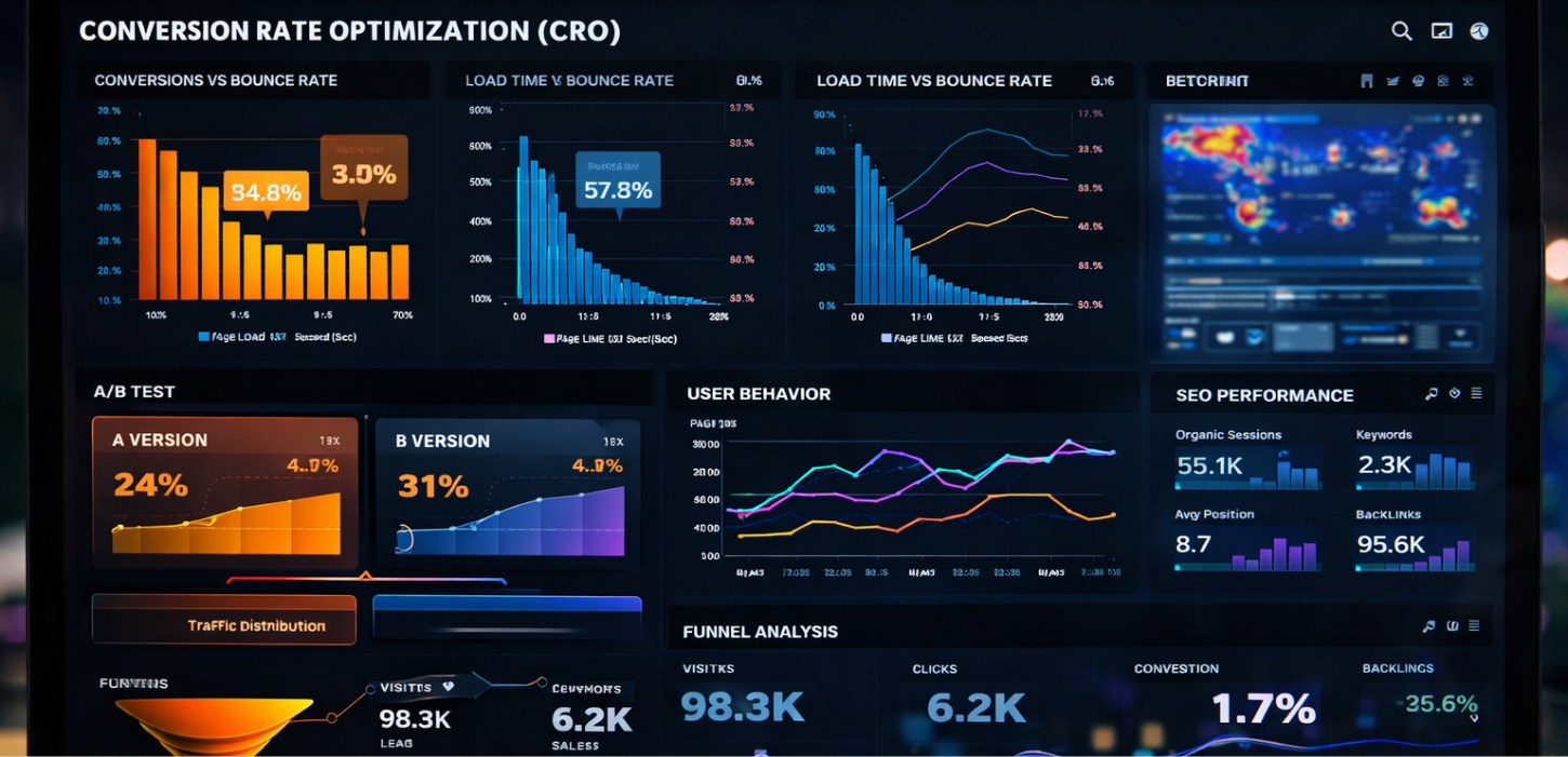
The primary metric for most lead generation landing pages is conversion rate, the percentage of visitors who complete the desired action. Industry averages vary widely, but a conversion rate above 5% is generally considered good for most service industries. Beyond raw conversion rate, track cost per lead if you are running paid traffic, form submission rates broken down by traffic source, and the quality of leads generated.
What is A/B testing and should I do it on my landing page?
A/B testing involves running two versions of a page simultaneously differing in a single element, such as the headline, CTA copy, or form length and measuring which version produces more conversions. It is one of the most reliable methods for improving landing page performance over time. You need sufficient traffic to run meaningful tests (typically at least a few hundred visitors per variation), but even businesses with moderate traffic can gather useful data from testing key page elements over several weeks.
Need a Landing Page That Actually Converts?
Exposure Media designs and builds high-performance landing pages backed by data and optimized for your specific audience.